The application of visualization techniques in power systems aims to present large amounts of grid information in complex-scaled systems in fast and intuitive manner. In turn, this helps the engineer to immediately identify the evolving state of the grid. Here, we present phenomena of interest in several synthetic grid cases using different visual techniques.
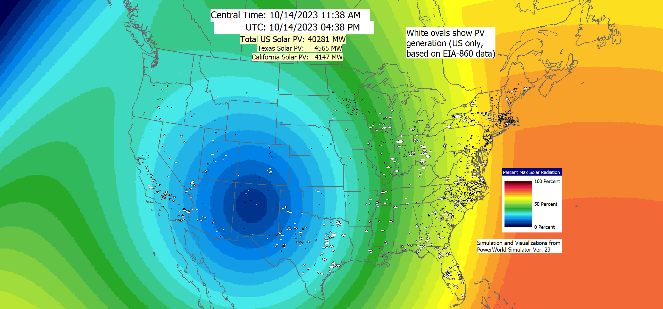
Video showing a visualization of the simulated impact of the October 14, 2023 annual solar eclipse on the US solar PV generation. The simulations and visualizations were done using PowerWorld Simulator Version 23. View Video
Effectively communicating the behavior of an electric grid is an important pursuit in education, research, and industrial applications. Texas A&M University researchers present considerations for visual storytelling as a means for interpreting and communicating the behavior of the grid for simulations ranging in duration from seconds to days. By framing the issue of communicating the vast amounts of data associated with wide-area transmission grid operation as a story to tell, those tasked with presenting this data are encouraged to consider what makes an effective story and, in turn, create compelling and understandable stand-alone narratives. Demonstrations are presented for cases of various scales including a 37-bus case, a 2000-bus case, and a 24,000- bus case.
24k-bus MISO/SPP Synthetic Grid Story of a High-Volt Line Outage
2,000-Bus Line Switching Story
A Day in the Life of the 37-bus Grid
Traditional one-line diagrams have been used to show topology of power systems, and in addition help visualize power flows. In large-scale power systems where complex interconnectivity and multiple overlapping of branches (A.C transmission lines, transformers and HVDC transmission lines) can obscure one’s view of flow directions, a regular one-line may instead cause more confusion to the power engineer. We propose that capturing high-level patterns of flows will rather intuitively provide greater information on the essence of the system power flows before any zoom-in task is performed. The figures below are a cluttered one-line diagram and then a planar graph representation of flows within a synthetic 82,000-bus system covering the entire geographical footprint of the United States.

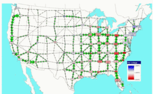
An application of the planar visualization is shown below during the stability simulation of an 82K system after a 2800 MW generator loss contingency.
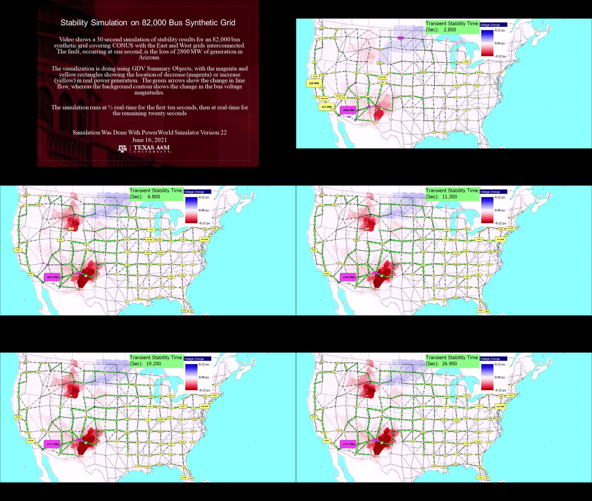
More details are available here
A coherent presentation of electric grid state information is a desirable feature for power engineers who desire an immediate perception of the state of their systems. As these systems evolve into large-scale and highly interconnected grids, a display of several state information within limited spaces can result in data clutter, and hence more confusion to the engineer. Here, a Pseudo-Geographic Mosaic Display – transitioned from Geographic Data View (GDV) objects (here) on a oneline diagram – has been used to display two branch attributes (MW flows and line limits) after a power flow computation in a synthetic system 2000-bus Texas system consisting of 3,209 branches.
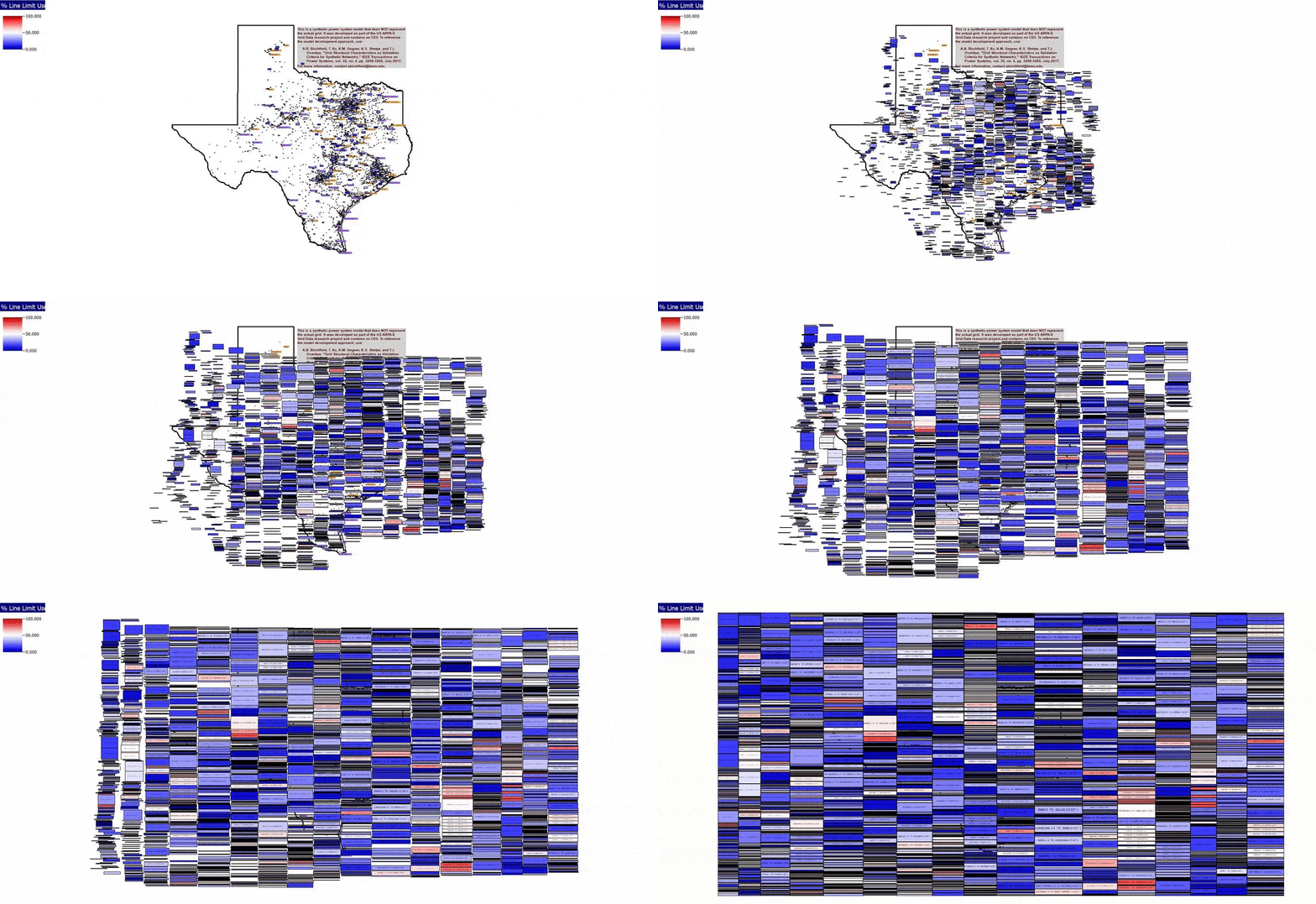
More details are available here
The highly non-linear nature of the power grid requires that an estimation of system states utilizes multiple iterations to determine grid bus voltages in a power flow evaluation. In recent times, the Newton Raphson iteration algorithm has become a standard method of evaluating grid voltages. Using contour visualizations, Figs. A-C are used to demonstrate wide-area, voltage evolution in different power flow (PF) convergence computations of the synthetic 2000-bus Texas system, and corresponding to loading conditions in different months. The iteration in each contour image is terminated when tolerable power mismatches are observed, after which the cycle repeats itself.
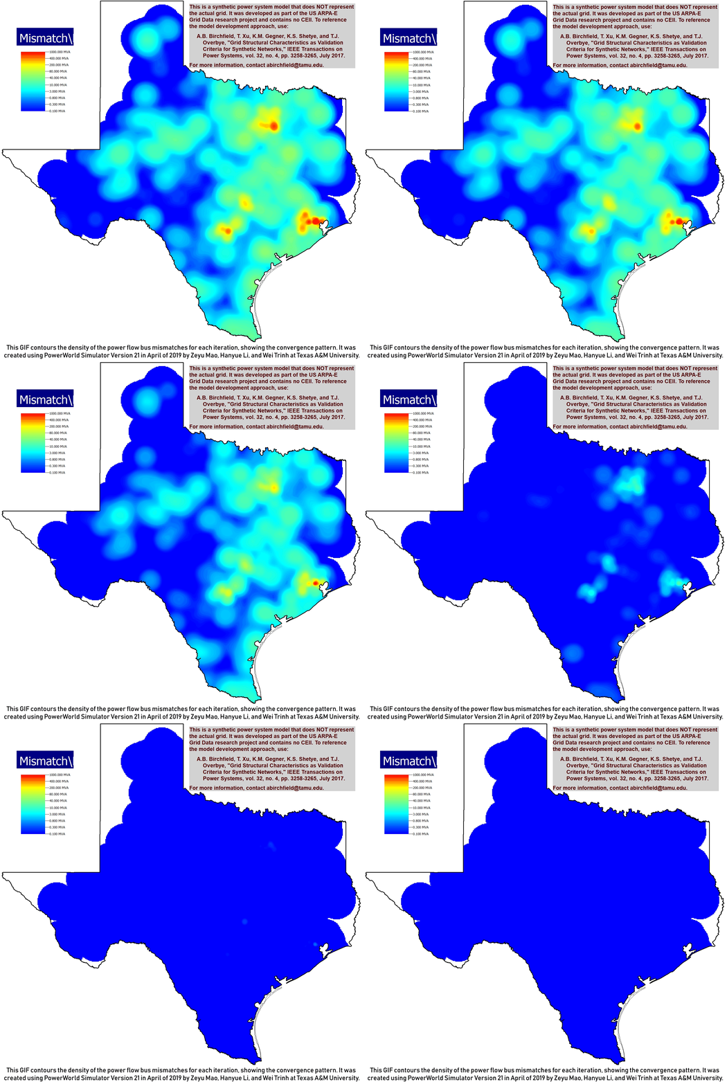

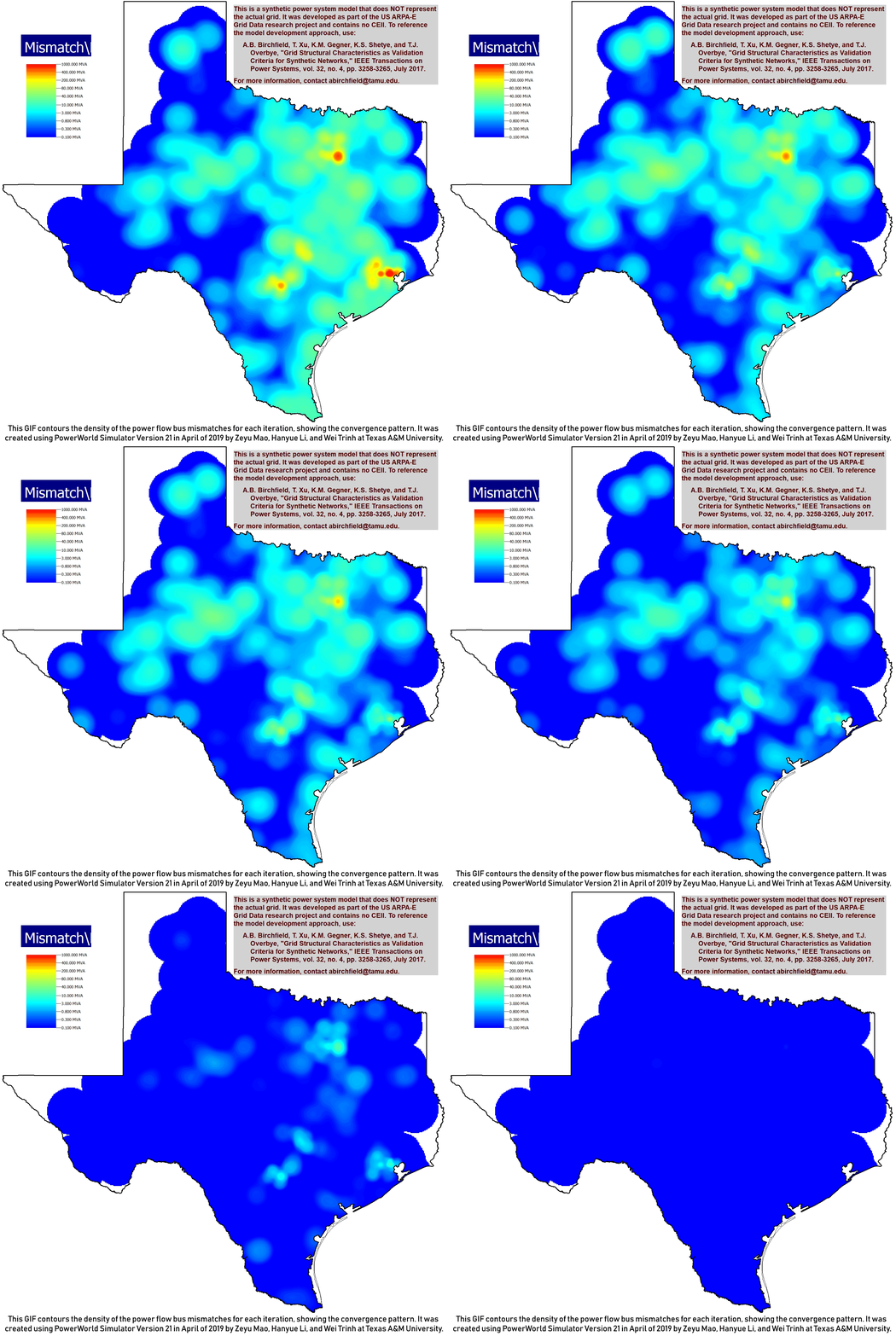
Fig. A: Base Case Convergence Fig. B: April PF Convergence Fig. C: October PF Convergence
Convergence of the Newton-Raphson power flow can be visualized through the use of contours. While the mismatch approaches zero (i.e. blue-colored contour) as the solution converges, a uniform contour indicates convergence of the density of mismatches across the grid. The different scenarios represent different load profiles of the year for the synthetic grid. So far, a significant observation is the localized hotspots of higher mismatches in certain areas (Houston, Dallas, and San Antonio) during the grid simulation. A hypothesis for this method of visualizing wide-area intermediary voltages during grid estimation is that it could help identify areas that could possess potential voltage problems during system operation. Further research work is still ongoing.
Note: Right-click on any of the contours to download. For further questions, kindly contact: Wei at weit1@tamu.edu or go to web page.
Tornado Scenario in the Illini 42-bus Case
Illini 42 Tornado Video – TS GMD PWDS MOV
High-altitude Electromagnetic Pulse Wave on the Illini 42-bus Case
IlliniGMD 42 HEMP Video – TS GMD PWDS MOV
Frequency Variation After a Contingent Generation Outage in a 10,000-bus Case
ACTIVSg10k Case Video – TS GMD OPF MOV
Voltage Variation After a Contingent Three-Phase Fault in a 2,000-bus Case
ACTIVSg2000 Case Video – TS GMD OPF MOV
Example Single Line Diagrams – These images show the single line diagrams which can be navigated in the PowerWorld format of the synthetic cases.

